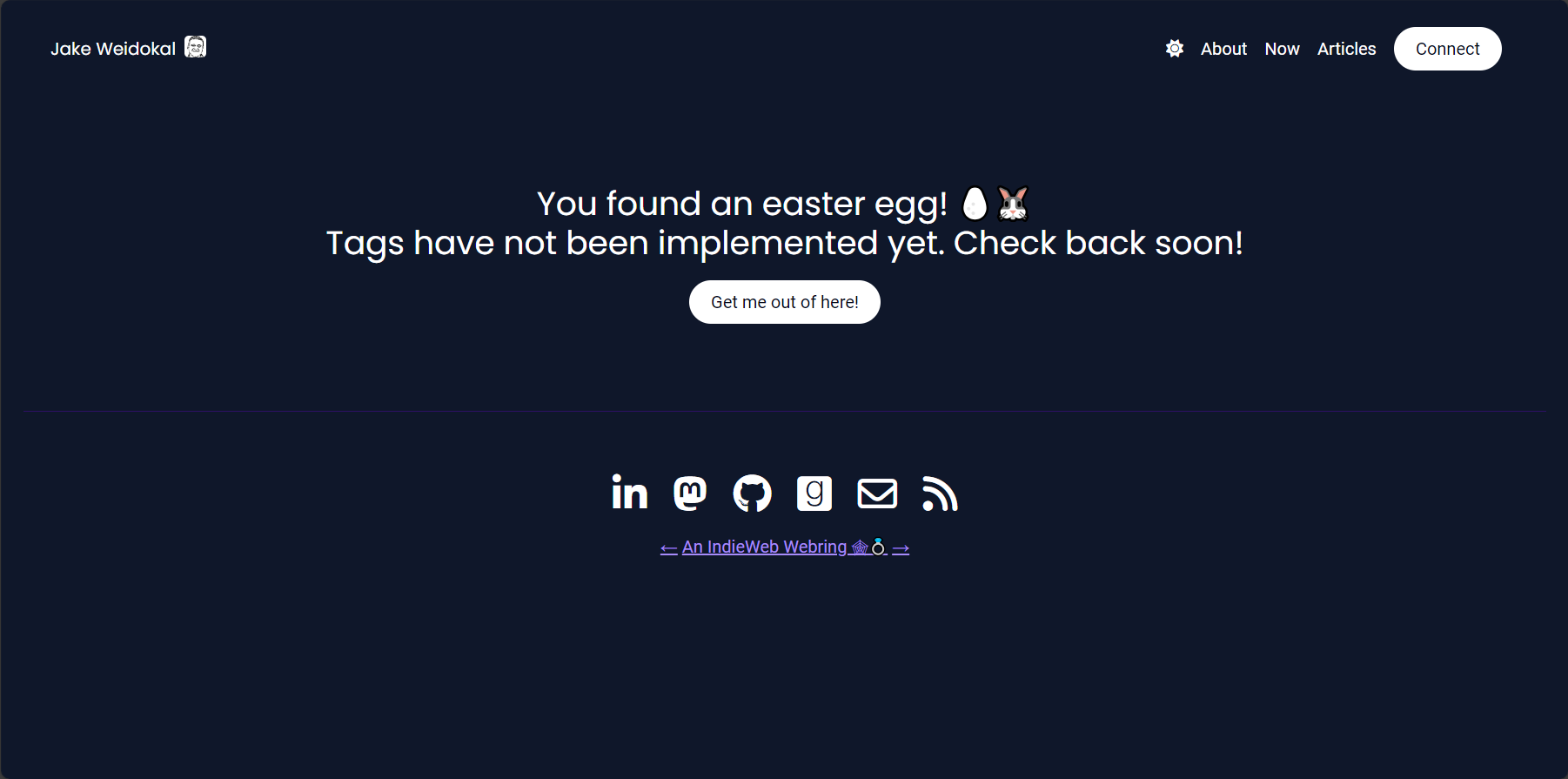
My website looked quite different at its beginning. I thought starting a blog would be a good opportunity to play around with new technology, so I decided to teach myself SvelteKit and build my site with it. It was very exciting: I would build in SvelteKit, write all my posts as standalone markdown files, and deploy on Vercel. As I started building and exploring what other people had done to get inspiration, I came across a concept called the IndieWeb. I felt aligned with the values of this web community, so I wanted to build my site to be part of it. Suddenly, my to-do list was expanding rapidly to include all sorts of IndieWeb specs and principles. Would markdown files be enough to do everything I wanted to do? Perhaps I would need to set up a database using something like Supabase…
The more I added to my to-do list for the site, the more I began to dread working on it. This was supposed to be fun, what happened?
I lost my Why. What I really wanted was to start writing. To have a place to share myself and to figure out how to do that. That was my Why. But I wasn’t clear on that. I thought this site would be a good place to write and be a fun coding project. Mixing those was a mistake for me. I became so consumed with perfecting the design and functionality that I had no time to think about writing.
So what to do? I had this thing that I built, that I actually quite liked, but it was taking me further from my Why rather than toward it.
I decided to tear it all down.
I threw everything away and started from a blank slate. How could I just write? How could I stay connected to my Why? A blogging platform, duh! Other people have already solved the problem of creating a website whose primary purpose is publishing writing. In fact, Manton over at Micro.blog solved that problem and built his solution on the IndieWeb principles I admire, so that was the clear choice for me. I took everything I had written and migrated it over to Micro.blog, abandoning my SvelteKit project.
After the migration, everything felt better. I had space to write, space to bring forth my Why. I still couldn’t keep myself from customizing themes and plugins to make the site my own, but a little bit of play is okay as long as it leaves my Why undisturbed.
Why had this not been obvious in the beginning? Well for one, I didn’t even know about Micro.blog or the IndieWeb when I started out. But more importantly, my thinking had been clouded by an unclear Why and a fear of judgment, which I’ve come to realize are connected. My fear was something like, “This is supposed to be a web software guy and he didn’t build his own site from scratch? He must not really know his stuff.”
That’s a silly fear. Who cares? Have you seen all the intelligent people working in the web space that host their sites on a platform? They’re everywhere! And yet, I could not come to that realization until I was really clear on my Why.
I share all of this to implore you to evaluate your Why. Do you have the right Why? Are you clear on it? Is what you’re doing moving you in the right direction? If not, it’s very possible that you can make minor course corrections to get you back on track. You should try that first. But if you’ve gotten far away from your Why, don’t be afraid to tear it all down. It’s okay to start at zero. The sunk cost has already sunk, so don’t drown yourself trying to save it.
Tearing it all down is not the fastest way to do a thing, but it may be the way to do the right thing.
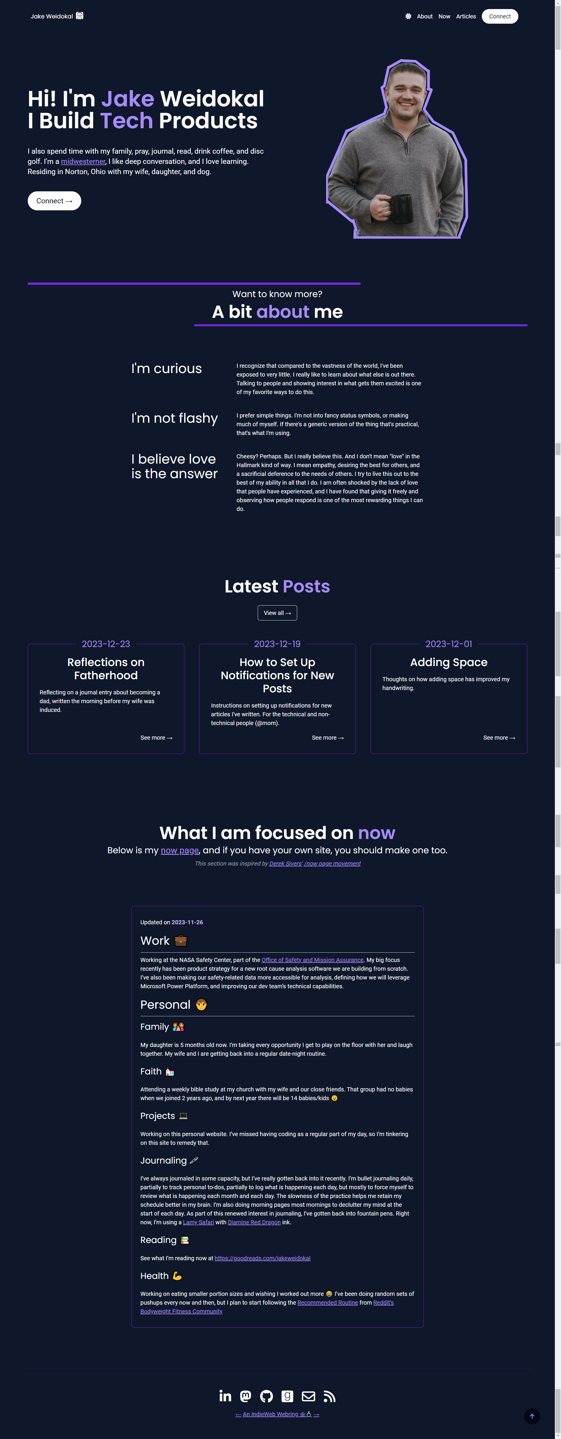
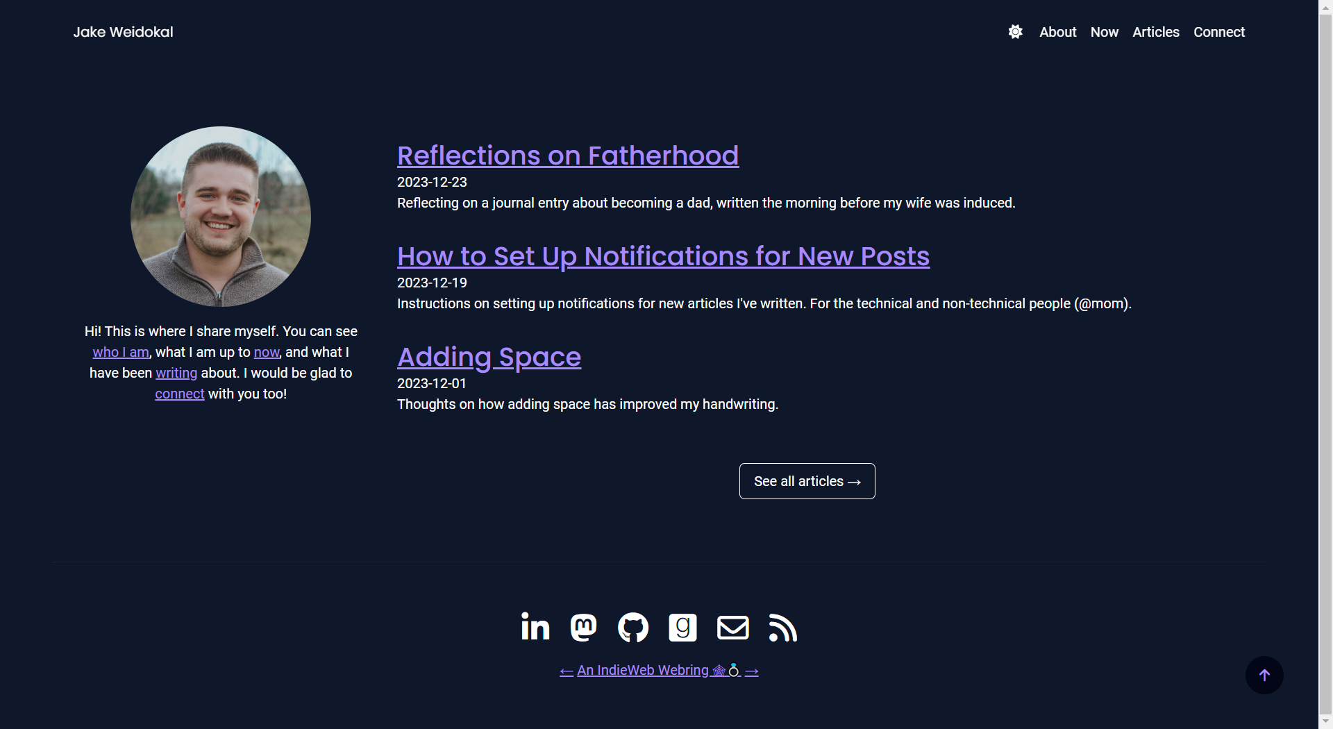
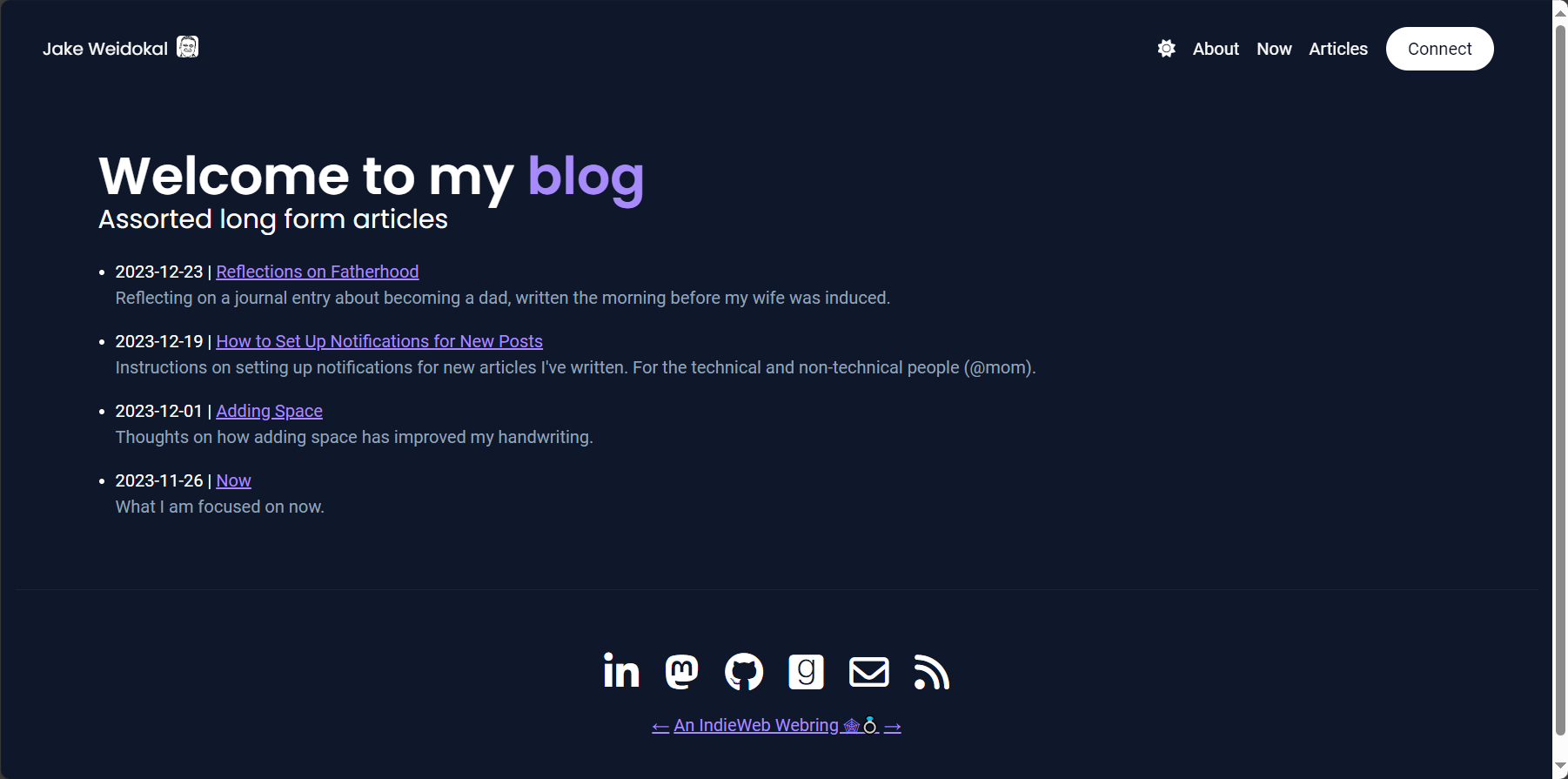
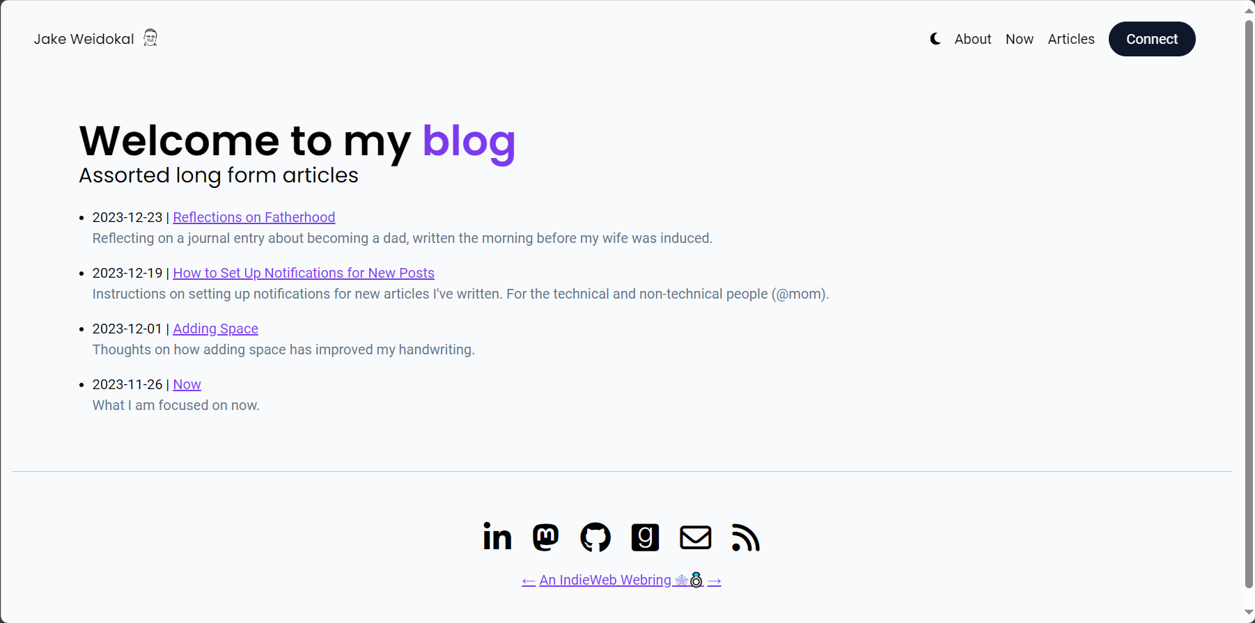
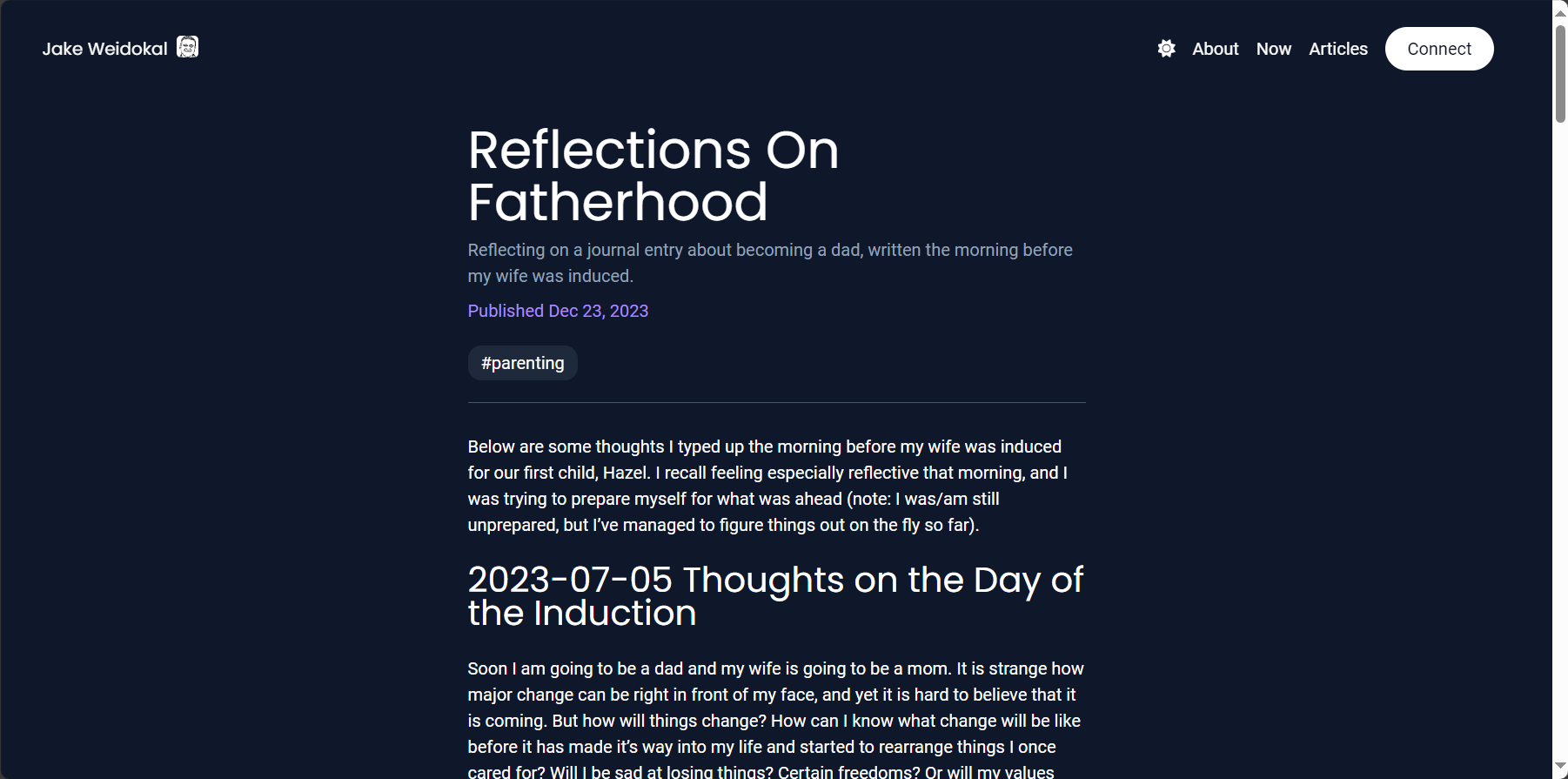
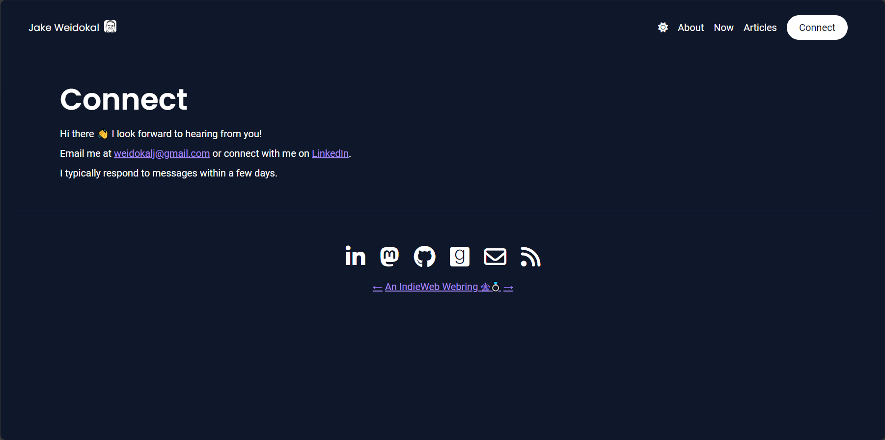
Here are some screenshots of what the site looked like before. I had a v1 for my homepage, which was ripped off from this YouTube video: Build & Deploy a Modern Web Portfolio w. SvelteKit & TailwindCSS (youtube.com). That felt fake and not like my own, so I started to simplify it into a v2 before deciding to tear it all down.
v1 homepage
v2 homepage
Articles page
Articles page - light mode
Article page
Connect page
Tags/Categories Page
