I have to admit, when I first launched Fed Meetup, I wasn’t very proud of the UX . I pieced it together quickly to meet a need at NASA, and didn’t make the time to go back and clean it up.
But that bad user experience has been a thorn in my side ever since I launched the tool. That’s why I redesigned it from the ground up.
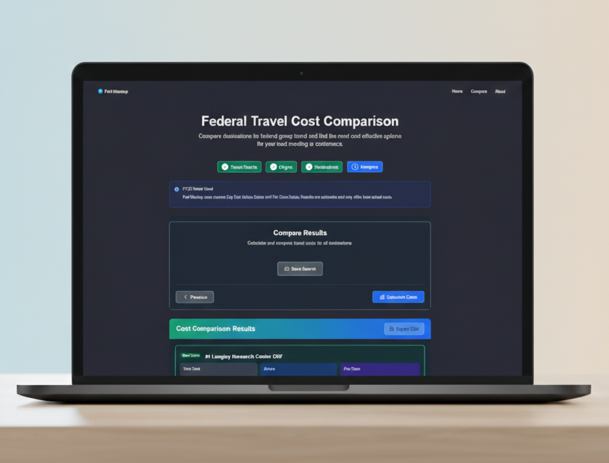
The result is a clean, intuitive, and much more beautiful interface. The new 4-step progress indicator helps you track exactly where you are in the process. Everything is now clearer and simpler.
This was a fun passion project to elevate the user experience. If you’re a federal travel coordinator, I hope you love using it as much as I loved building it.
Check it out and let me know what you think!